 But the biggest problem I saw was that the focus of the site, and specifically the home page, was all wrong. As the new kid in town, I didn’t want to give the impression that my barrels were ablazin’ and I was looking to shoot down everything in my way, so I came up with the idea of creating a “heat map” of the home page to make my point in a logical and unemotional manner.
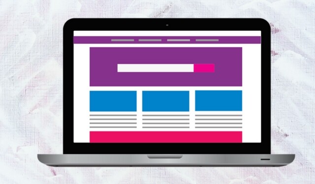
Creating the heat map was easy. I took a screen shot of the home page and pasted it into PowerPoint. I then deconstructed the page into a color-coded wireframe by covering each section with a box using the following color scheme:
- Red for company content and links
- Yellow for product/service/technology content and links
- Blue for customer-oriented content and links
- Green for lead generation content and links
You could certainly add more colors if there are other categories that are important to your company.
Adding Customer Focus
Here is the heat map I built of the old home page.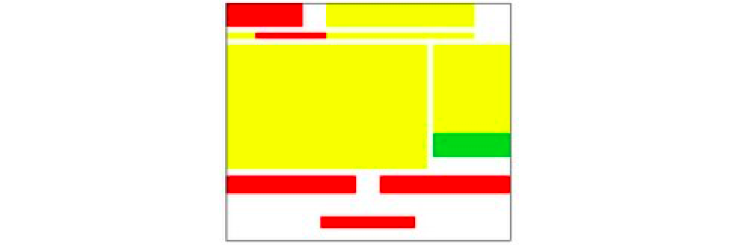 Even though I knew the site had problems, I was stunned by the heat map, and so was my boss. There was zero customer-oriented content. It was all, with the exception of one small lead generation link, about the company and its technology.
Here is the heat map of the new website that we developed.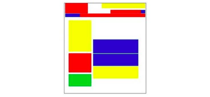 You can see that this page is much more balanced. The all-important customer content is front and center, and the amount of company and technology content is greatly reduced.
Better Lead Generation
This exercise was so eye-opening, I went back and retroactively applied heat maps to the before-and-after versions of other websites I’d (re)built. Here’s another example where the home page was at odds with the company’s goals. The before page below dedicated more than half the real estate to information about the company. But lead generation was our number one goal!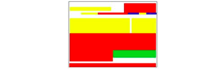
The heat map of the re-designed home page shows how company content was minimized so that we could significantly increase the real estate devoted to generating leads. It’s important to note that, in this case, we only tweaked the home page. You don’t necessarily have to re-design your entire website to benefit from this exercise.
Better Everything
In this next example, I didn’t need a heat map to see that the home page needed a lot of help, but the heat map underscores the problem. Not only did the home page not have any customer-focused content or lead generation opportunities, it didn’t even include any information about the company’s services. It was just a list of business units!
This website overhaul was a major undertaking. And while there was certainly room for improvement in the new site, the heat map shows that we were at least on the right track.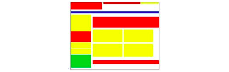
So, go ahead and build a heat map of your home page. It takes just a couple of minutes and you may be surprised by what you see. Compare your heat map to your objectives. If the focus of your home page doesn’t match your objectives, it’s time to re-orient it. Even a few minor tweaks to your home page’s organization and copy can make a difference.
Need help with your website? We do digital.