Planning and Setup
DO think about how your presentation will be consumed. Is it for a big keynote session where the audience is expecting to be entertained? Then limit the amount of text on the slide and think about using large, full-bleed imagery. Or, will your presentation be more of an informational leave-behind piece? If so, try including an appendix at the back with more detailed information so you don’t have to cover too much material in the presentation itself.
DO consider all aspects of how the presentation will be used before you get into designing it. For example, if you’re printing the PowerPoint as a handout, you may want to utilize an all-white background for your design instead of a dramatic all-black backdrop.
DO utilize the slide master. Have you ever encountered a situation where there are some elements on a slide that you can’t click on or manipulate? Don’t worry, those can be found in the slide master template. (View > Slide Master). You will often be working from decks that already have an embedded corporate template, but if you’re starting something brand new, you should always begin with the master. Using it will allow you to create a focused and consistent look throughout the deck. This also means that you’ll be able to lock certain elements from future users that may go rogue and try to create their own…er…masterpieces. Also keep in mind that copying and pasting slides from other decks will also paste their corresponding slide masters into your presentation, but you can always select which master you’d like a specific slide to mirror.
Content
DO have a narrative and a plan in place before you begin creating your slides. Pasting in a series of random slides from other decks will yield an unfocused and confusing presentation. Your slides should be treated as a story with a beginning, middle, and end. Use section headers and an outline to help you organize your thoughts and build out the plan.
DON’T put too many things on a slide – bullets, copy, WHATEVER. The most important mantra when working in this medium is LESS IS MORE. Keep it short and sweet. There should be a balance between content and visuals. You want your audience to focus, so peppering them with too many elements at once is going to confuse them.
DON’T use low-resolution images. Does the image look fuzzy and pixelated? Then don’t use it. Remember that the PowerPoint may be projected on an even bigger screen and those images could look even worse.
DO learn how to resize images properly. It’s as easy as holding shift and dragging the corner of the image to the desired size.
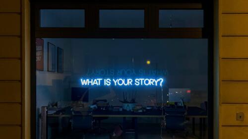
DON’T steal images from Google or other similar repositories – you don’t have the rights to use them. There are plenty of free and paid resources out there that you can choose from: Shutterstock, iStock, Getty (paid) or Creative Commons, Pexels, EveryPixel (free) just to name a few. Think about the images you’re choosing – there’s a lot of cliché imagery out there. Make sure that whatever you choose is contributing to the mood of the presentation and your message.
Design, Effects and Animations (oh my!)
DON’T use colors that clash. Stick to your palette if you have one. If not, create your own consistent set of colors to use. Don’t use anything too dark and muddy or too bright. Avoid using the primary colors untouched: red, green, and blue. These become very stale or can be too intense.
DO use effects in a SUBTLE manner. Drop shadows and gradients were once faux pas, but all of that has changed if executed correctly. This is another scenario where less is more comes in to play. A subtle drop shadow or gradient to imply depth is a good thing. Strokes (or outlines) are rarely executed correctly. If you’re uncomfortable with the nuances of applying these kinds of advanced techniques, that’s okay! Leave that to more advanced users and stick to the basics.
DON’T use excessive animations or transitions. Animations and builds are a good way to take your audience through a story and provide an extra advanced visual element to make everything feel more professional. But just because you can do something, doesn’t mean you should. Again, we’re applying less is more to this aspect as well. Every release of PowerPoint seems to include more and more dips, spins and checkerboard wipes, but these presets often feel cheesy or boxed. A simple fade is usually all you need.
DO compress the deck before sending it around. PowerPoint has built a very simple command that can be found in the main menu that allows you to compress the pictures down to a certain resolution. This will drastically reduce the file size which will make the file easier to share and open.
The most important thing to remember is that if you don’t know how to do something, just use the help function. Or Google it! PowerPoint is by no means a perfect application, and chances are other people have had the same challenges. And if you have a really important presentation you need help with, let us know!