February 22, 2024
April 11, 2024
Should environmental journalists influence readers to be more sustainable?
April 8, 2024
A Guide to Social Media Listening in Market Research
April 3, 2024
5 Top Tips for a Power Lunch
March 28, 2024
THIS MONTH IS SOCIAL: The Viral Willy Wonka Experience
March 6, 2024
Global marketing agency scales leadership to capitalise on growth
GLOBAL MARKETING FIRM SETS NEW RECORD FOR COMMUNITY CAMPAIGNS SUPPORTED IN A YEAR
January 29, 2024
Award-winning Marketing Agency Opens Internal Training Platform to Public
December 22, 2023
Port of Antwerp-Bruges joins forces with TEAM LEWIS
December 12, 2023
Cynicism from within tarnishes UK plc ESG efforts
December 6, 2023
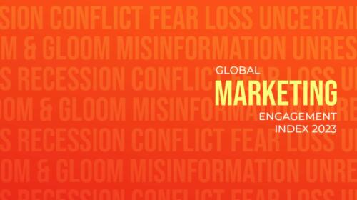
NEW REPORT REVEALS VULNERABILITY IN MARKETING
March 8, 2023
Research For International Women’s Day Reveals New Challenges Faced By Women
January 19, 2023
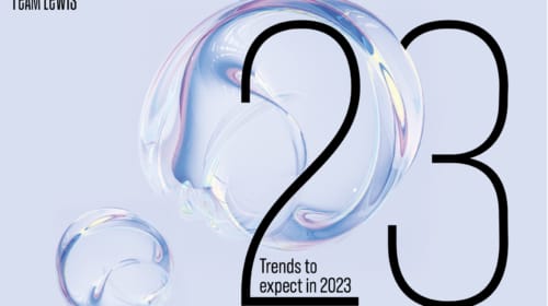
Global Marketing Experts Reveal Key Trends For Year Ahead