February 23, 2024
May 8, 2019
Bay to Bay | An Innovation Accelerator-Highlights from Shenzhen’s Bay to Bay
December 13, 2018
Bay to Bay | Highlights From San Francisco’s Bay To Bay Media Panel
November 21, 2018
Bay to Bay | Could China’s Greater Bay Area help Silicon Valley innovate
October 29, 2018
Bay to Bay | Bridging China, Connecting The World
April 15, 2024
Redefining PR success: Measure what matters
April 5, 2024
How to Become a SEO Competitor Analysis Grandmaster
April 3, 2024
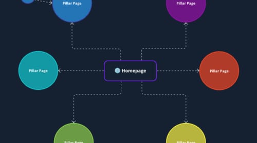
Fishing For SEO Results to No Avail? Try Topic Clusters for SEO
April 2, 2024
SEO Best Practices for Title Tags, Meta Descriptions and On-Page Optimisation
April 8, 2024
Future Spotting: 6 Ways Personas Enhance Digital Marketing
March 5, 2024
Future Spotting: 6 Traits of Gen Alpha
February 5, 2024
Future Spotting: 5 Consumer Search Behaviour Trends in 2024
November 29, 2023
Future Spotting: TikTok Search Ads
March 6, 2024
TEAM LEWIS Opens Second Office in France
GLOBAL MARKETING FIRM SETS NEW RECORD FOR COMMUNITY CAMPAIGNS SUPPORTED IN A YEAR
January 30, 2024
Award-Winning Marketing Agency Opens Internal Training Platform to Public
December 6, 2023
NEW REPORT REVEALS VULNERABILITY IN MARKETING
January 25, 2024
Webinar: China Social Trends
December 19, 2023
COP28: A Crucial Gathering for Climate Action
July 1, 2023
Power Up Your Performance Marketing
March 16, 2023
Complete SEO Glossary for Beginners