If you’re an avid follower of the LEWIS blog, you know that we’ve covered all sorts of research and survey topics to help make you a more informed marketer. This includes everything from conducting relevant market research for your brand to writing an effective questionnaire to identifying actionable insight from data points and survey metrics. Properly conducted surveys are incredibly helpful and impactful for positioning your brand as an industry leader, especially in the realm of PR pitching.
How Else Can Survey Results Be Used and Marketed?
As a digital marketer with a background in social media and content marketing, one of my favorite ways to share survey data is through the use of infographics. And yes, I know by now everyone has seen their fair share of these typically long, oftentimes overwhelming images. But a good infographic shares info in a concise manner and is just a starting point for various other ways to share your findings.
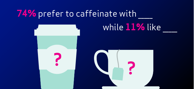
To illustrate this point, I worked with another Amy here at LEWIS, our Senior Research Director (because two Amys are better than one… that’s a saying, right?). Together, we conducted a survey of our employees’ demographics, likes and interests. After all, we bet you’re dying to know if the LEWIS team owns more cats than dogs, prefers summer to winter, or chooses to caffeinate with coffee or tea.
In this blog, we’ll show you why we chose to create an infographic to share our employee survey results and how we’ll use various marketing channels to amplify our findings.
The Starting Point: The Infographic
Here’s the pride and joy of our survey results: our “Survey Says” infographic — at the end of this blog! After our data collection, our research team conducted a survey analysis to tabulate the response and look for trends, surprising results, comparisons and so on. We then shared the key findings with our designer to visualize our results. There are so many different kinds of infographics out there that you might want to experiment with a different type of layout and iconography to share your marketing data and survey results in a way that stays true to your brand.
The Foundation for Further Marketing: The SEO-Optimized Blog Post
As you can already tell, we’ve shared our infographic with you via blog post. This is one of the best ways to host your infographic because it allows your audience to see it in full and gives you an opportunity to create content around it that can be used for SEO purposes. At a minimum, you can use the copy in the graphic in the blog post but consider taking it a step further by finding keywords and search queries relevant to your marketing data or survey results. From there, your infographics can be used in PR pitching. You have an easy-to-digest graphic visualizations highlighting important data, and you have it all in one central location to share with media contacts.
The Amplification: Social Media
My favorite part of conducting a survey is sharing the results with interested audiences, and what better way to do that than with social media? However, sharing a large infographic on social media provides a poor user experience. Depending on the platform, some sites won’t let you upload an image that large, and if they do, the graphic can be hard to read. Be sure to check the latest social media image guidelines for reference.
Even with the infographic being the foundation of your survey results, it’s important to take a “social first” approach to sharing the data. This can be done in a number of ways.
Teasers and Infographic Snippets
Using our LEWIS infographic as an example, we could create social graphics or GIFs announcing we’ve conducted a survey and that we’ll be sharing the results. Our header lends itself well to this.

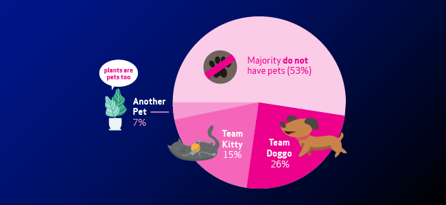
Once we’ve done those initial posts, we can share portions of the graphic, like the pie chart below, and direct people to the blog post to see the final result (there’s another use for that blog!). Consider sharing multiple chart types as a series of social posts to highlight a popular survey question and participate in a social trend or holiday. #NationalPetDay perhaps?
We can get more creative and share components of the infographic with the results omitted, which is another way to drive people back to the blog post in search for the answer.
Engagement Opportunities
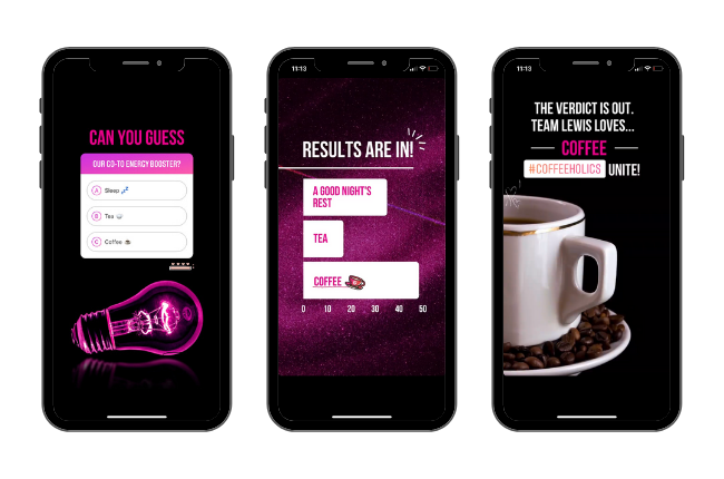
In all of the examples above, a question can be included to get the audience to guess or weigh in on what they think the survey results will be. But consider using platform-native features for further amplification and engagement. Twitter polls and Instagram Stories’ quiz and poll features can be extremely helpful in getting more eyes on your content.
But Wait, There’s More…
Everything above shows just how much mileage you can get out of one creative asset. A single infographic can support efforts across PR, SEO, social and more. It’s important to remember that when you dedicate time and energy to something as big as a survey report or marketing data summary, you need to showcase your results to get the most bang for your buck. An infographic helps you do that.
However, don’t forget all the data you collected leading up to this point. In many cases, survey data can be looked at through a cross tabulation or from different perspectives to uncover new relationships in your survey results.
In our LEWIS survey for example, we could do follow-up blog posts about each office’s results. We might find that while fall is the overall favorite season of our US employees, summer might be the winner among our San Diego colleagues. This is a fun example but imagine if you conducted a survey of top-level executives across various industries on their opinions of remote work. You could hone in on CEOs vs. CTOs or Marketing vs. B2B Tech. You might find a new pitching angle, a pillar asset to build blog content around or a series of informational social posts. The sky’s the limit when you use your data in creative ways to share it to its full potential!
Looking to conduct your own survey? Check out our market research services and let’s talk!
*Note: Survey was conducted prior to the 2020 global pandemic; our US employees are not currently commuting to their respective offices or traveling between offices.