Businesses are in constant competition for the limited attention of potential customers. And with more people using the internet than ever before, individual design elements on your home page, landing page or blog post can make all the difference.
Enter the call to action button. Call to action (CTA) buttons or CTA link text plays a crucial role in pushing potential customers further down the sales funnel. A CTA is an action word or action phrase, in the form of a clickable button or anchor text within website copy, that directs a website visitor to take immediate action on your website. This immediate action is a specific action that should turn your website traffic into conversions. These conversions should be specific, measurable and achieve your marketing team’s goals. Ideally, CTAs lead your potential customer to your products, services or content quickly and easily.
While writing an effective call to action may seem simple, it’s commonly misused, leading to missed opportunities. A successful CTA will cause your target audience to take a desired action, falling into your lead generation strategy or converting into an actual buyer. When planning and designing your website or landing page, you should therefore start with the following W questions:
What is the topic of the page?
Why should the user be interested in the products and services offered?
Where should the user visit next?
A CTA is a specific action that your website visitor should take, such as download a whitepaper, contact your company or buy one of your products directly. It’s either a direct appeal, for example the CTA, “Buy now,” or a less intrusive command, such as “Read more.” In general, CTAs should to be catchy, convincing and simple in order to get your visitors to take action and click. Your clickable button or anchor text should be an action phrase, should be clear and should stand out from the rest of the content on your page.
Call to Action: The Copy
There are a number of factors that can make or break an effective CTA. One of the most important aspects is the copy you use for your button or hyperlinked CTA. Some of the most frequently used CTA copy is below:
- Get started
- Sign up for free
- Contact us
- Join free
- Show now
- Learn more
- Buy now
- Try for free
Call to Action: The Design
According to the Von Restorff Effect, also known as the isolation effect, if there are several similar objects, the object that is different from the rest is always the most memorable. Your CTAs should therefore stand out among other images and text. The most efficient way to do this is with color. In order to draw the user’s attention, make your CTA button color or hyperlinked CTA text one of your brand colors, as opposed to black, white or grey. Button color or link color is essential to creating a compelling CTA.

The buttons as well as the surrounding content, such as headings, images and descriptions, form natural clusters. Clustering content and elements correctly can lead to a better reading flow and help draw the user’s attention toward something you want to emphasize — such as your CTA. While you’ll inevitably have other design elements, such as images and text headings, on your website and landing pages, they should not deviate the reader’s attention away from your CTA. A great example that you wouldn’t necessarily think about is the people in the images you select. A test showed that pictures with people looking directly at the user are too distracting and deter users from continuing down your website page. Pictures with people looking past the viewer are therefore more natural and cause users to seamlessly continue to scroll down your web page.
The gallery was not found! The gallery was not found!
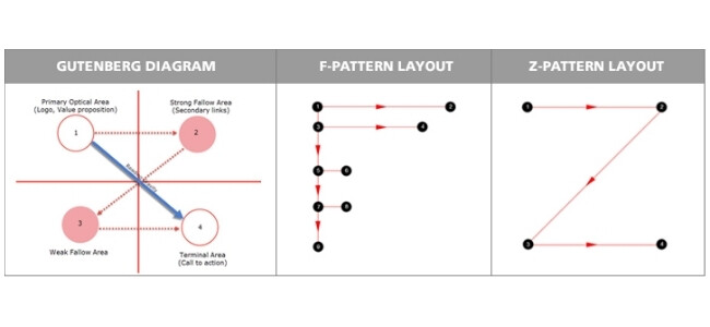
By arranging on-page copy and images in such a way that a natural reading flow is promoted, the user will easily end up at your CTA. The most common pattern that the eyes follow when reading a web page is the F pattern. Abiding by this pattern will cause a marketer to place a CTA on the left side of the web page, below a bigger section of text. On the other hand, one could argue that the user’s attention decreases when reading from top to bottom and from left to right. This phenomenon is accounted for by the Gutenberg diagram, which says that the upper left area on a web page grabs a user’s attention the most. Additionally, if a user reaches the lower right part of a landing page, there is also a natural interruption in the reading flow, which allows for another prime CTA placement.
(Source)
Attention Maps
Attention maps are a helpful way to test designs. With the help of eye tracking, it records where the user is looking and how much attention he/she pays to individual elements. The more intensely the user looks at a website, the higher the probability that he/she has absorbed the information. Since a complex and expensive eye tracking experiment with a test person is only carried out in the rarest of cases, most marketers rely on predictions other software provides. Tools, like VisualEyes, can predict how the experiment would turn out with an accuracy of 84%.
![]()
![]()
(Example Attention Map)
The distribution of the viewer’s attention is given as a percent on the attention map. So 187% means that attention is 1.87 times higher than the average probability that a user has noticed a certain element.
An acceptable value is far greater than 100%. Basically, the higher the percentage, the better. Comparing alternative layouts and elements is particularly important in understanding your target audience’s distribution of attention. The individual design elements and the layout must always be viewed in relation to one another in order to determine the most ideal location for your CTA button or CTA text.
Creating a landing page takes a lot of time and planning. In preparation, you should therefore keep you CTA text, design and placement in mind before clicking “publish.” Remember, an effective CTA can either turn potential customers into buyers, or simply fall flat.
If you need additional web development or content support, don’t hesitate to contact us.